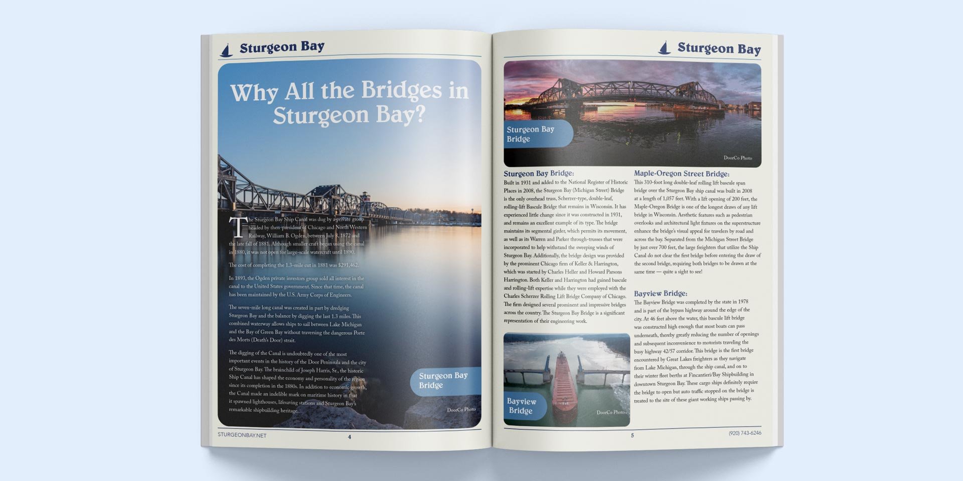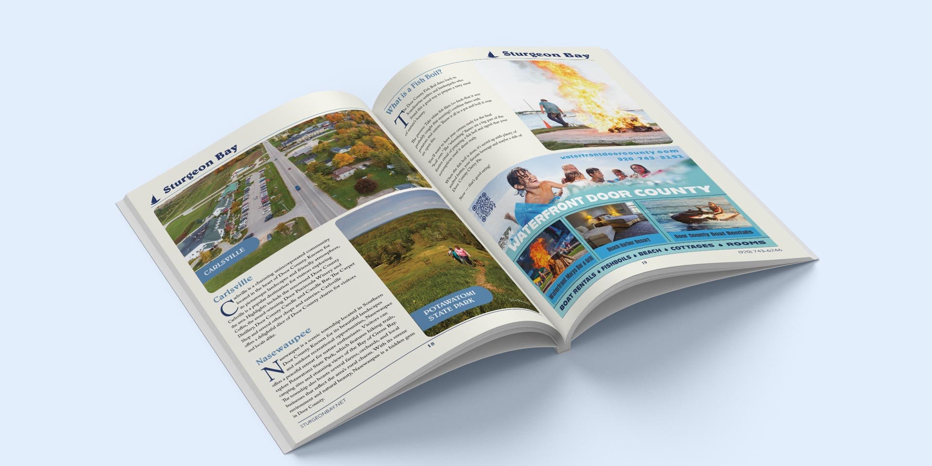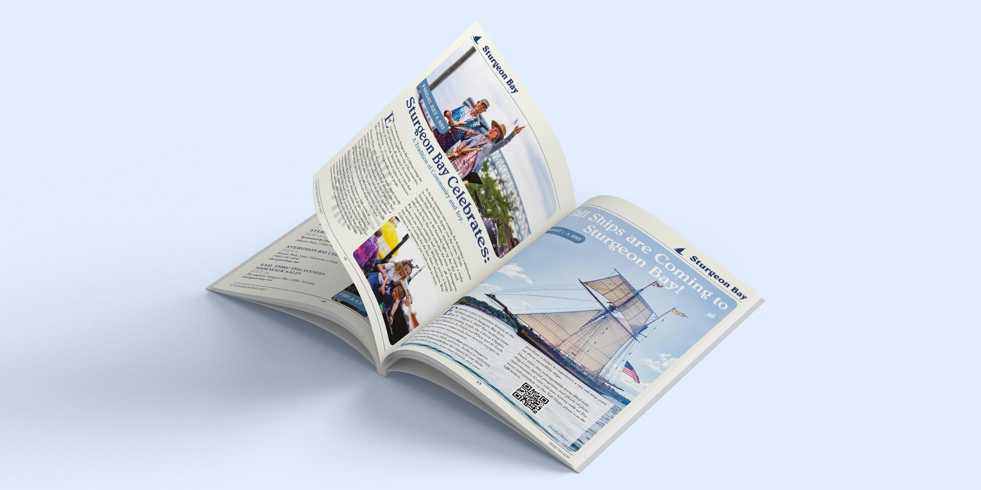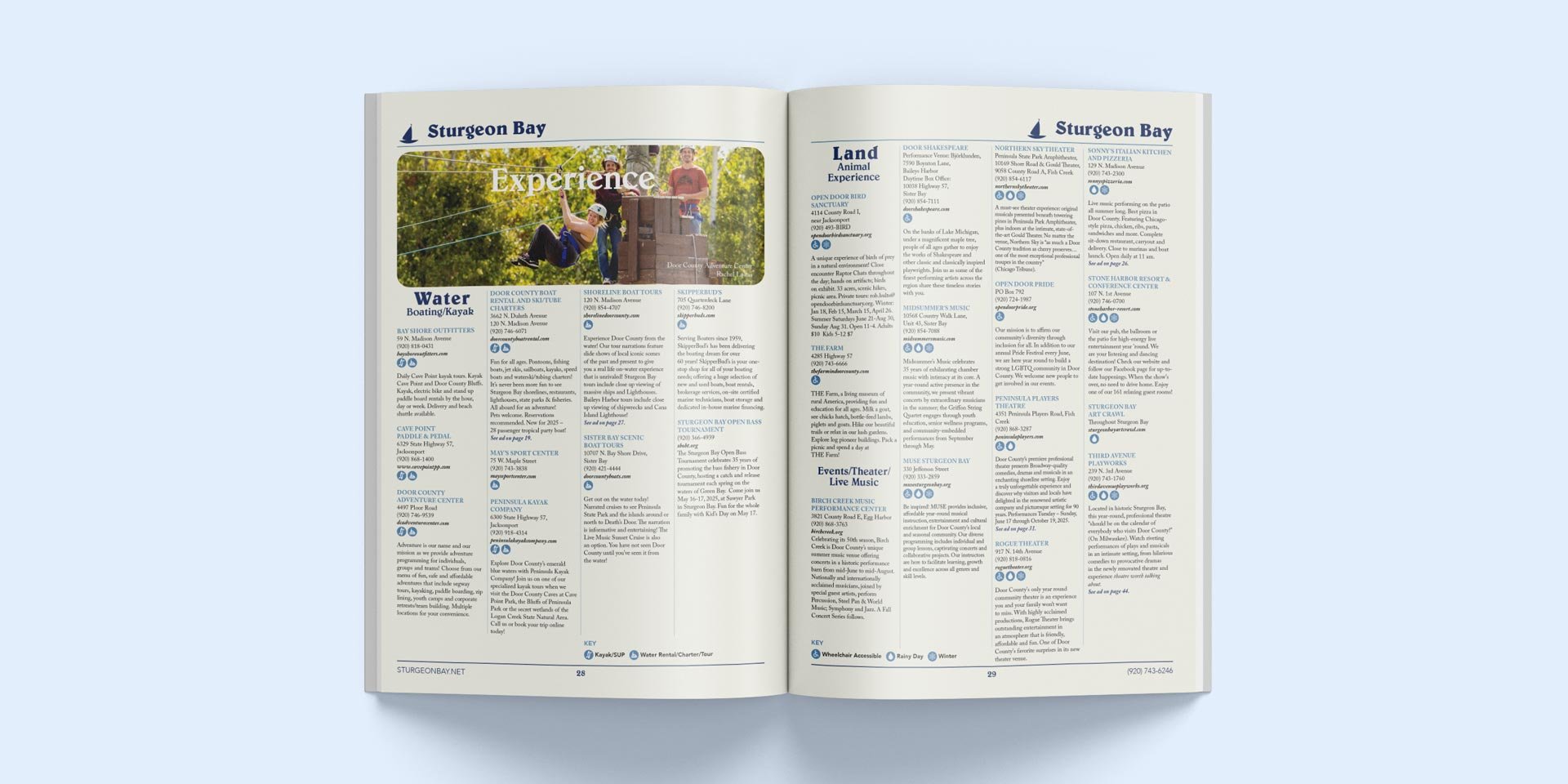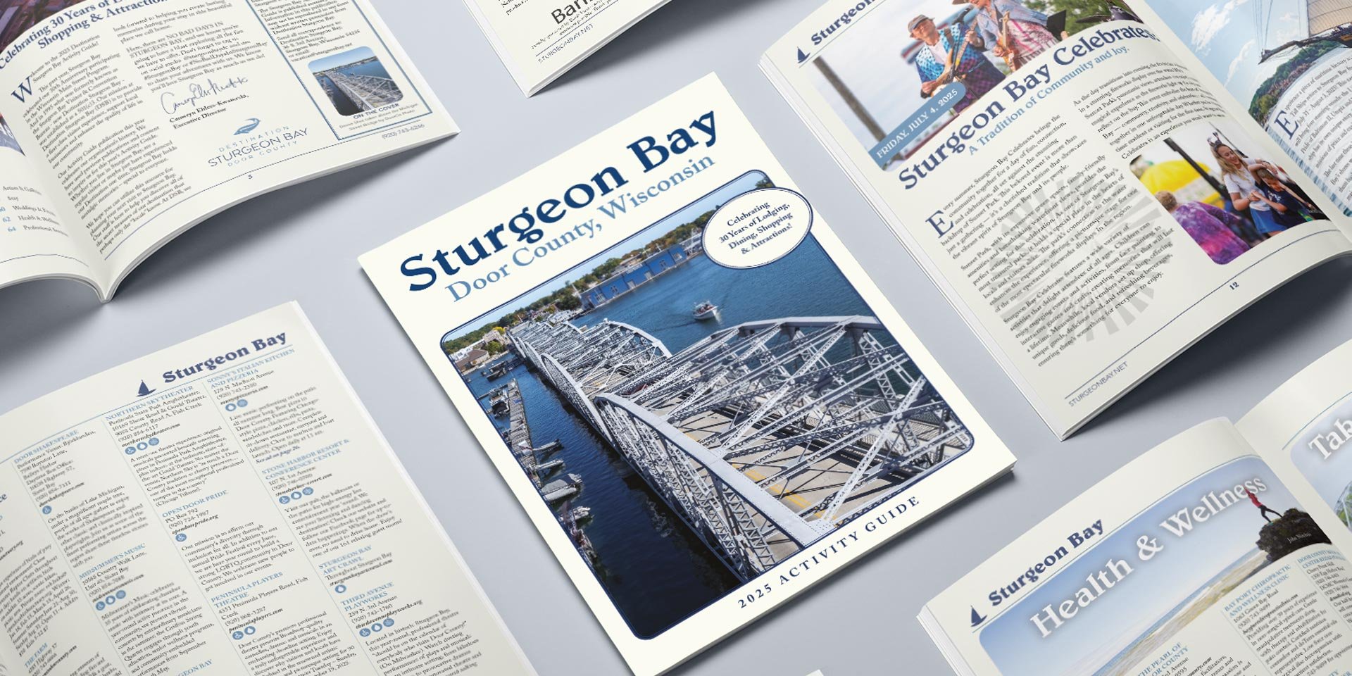
Destination Sturgeon Bay Activity Guide
Print Design
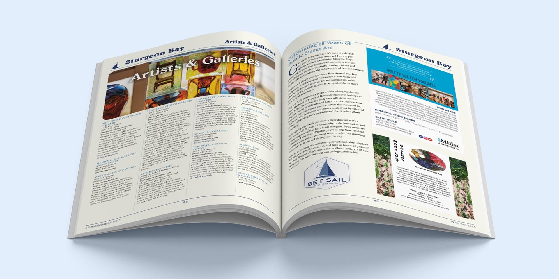
In 2025 Destination Sturgeon Bay wanted to celebrate the 30th edition of its activity guide by paying homage to past editions.
I designed a visually engaging layout that balanced nostalgic elements with a contemporary user experience. In collaboration with the Destination Sturgeon Bay team I curated content that resonated with both locals and visitors.
I oversaw production coordination to deliver a high-quality finished product on deadline.